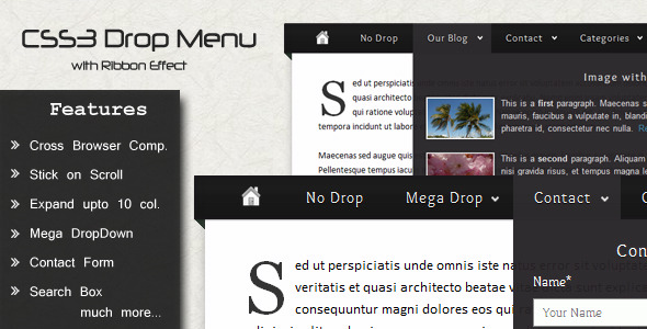
When you need a website navigation menu that moves beyond the basic list of links, you need an interface element that engages visitors, organizes complex information, and reinforces your brand identity. The CSS3 Drop Down Menu delivers precisely this, combining the visual drama of a ribbon effect with the structural muscle of a small mega menu. Built entirely with CSS3 for modern performance and backward compatibility, this menu system is engineered for web designers and site owners who want a polished, interactive navigation experience without relying on heavy JavaScript frameworks. Whether you are managing a content-rich blog, a service-based business site, or a portfolio that demands visual flair, this menu provides the architectural foundation to guide users intuitively while making a strong first impression.
Key Features
- Ribbon Effect – A distinctive, visually anchored design element that makes the current menu item stand out. It functions as an active state indicator, drawing the user’s eye to exactly where they are in your site’s hierarchy. This is not just decorative; it reduces cognitive load by providing immediate location context.
- Deep Tier Support – Unlike basic drop-downs that often break under the weight of deep subpages, this menu gracefully handles multiple levels of nesting. You can build out complex site architectures—like corporate intranets or e-commerce category trees—without losing visual coherence or user control.
- Small Mega Menu – A compact mega menu that allows you to display multiple columns of content beneath a single parent item. This feature is perfect for grouping related products, service categories, or blog topic sections in a single, scannable block rather than a long, vertical list.
- Contact Form Integration – A built-in, lightweight contact form drops down directly from the navigation bar. This eliminates the need for a separate “Contact” page load, keeping visitors on the page they are currently viewing and reducing friction in the conversion process.
- Expandable Search Box – A sleek search input field that expands with a smooth transition effect when activated. It maintains a compact footprint until needed, keeping your header clean and uncluttered while providing powerful on-site search functionality.
- Social Icons Menu – Pre-styled, ready-to-link social media icons integrated directly into the navigation bar. This increases your social following and engagement without requiring separate widget areas or complex plugin configurations.
- Transition Effects – Smooth CSS3 transitions on hover states and menu openings. These subtle animations enhance the user experience by providing visual feedback that feels responsive and modern, without being jarring or slow.
- Cross-Browser Compatibility – Tested and functional across all major browser environments, including Internet Explorer 7+, Google Chrome, Mozilla Firefox 3+, Safari, and Opera. You can deploy this with confidence knowing it will render correctly for the vast majority of users.
This feature set directly addresses the common pain points of site navigation: visual appeal, structural depth, and functional integration. Each feature has been implemented to serve both the aesthetic goals and the usability needs of a modern website.
Who Is This For? Use Cases
Web Designers and Freelancers Building Client Sites
If you design websites for a living, time is your most valuable asset. The CSS3 Drop Down Menu eliminates hours of custom CSS and JavaScript debugging. You can drop this menu into a wide variety of WordPress themes or static HTML sites, configure the deep tiers and ribbon colors, and deliver a professional, feature-rich navigation system to your clients. It works especially well for clients who manage content-heavy websites with many pages and subpages, such as law firms, universities, or insurance agencies, where clear organization is critical.
E-Commerce Store Owners with Large Catalogs
For online stores using platforms like WooCommerce, the small mega menu and deep tier support are game-changers. You can create parent items for “Men,” “Women,” “Accessories,” and then use the multi-column layout to display subcategories like “Shirts,” “Pants,” and “Shoes” side-by-side. This allows customers to see the full breadth of your inventory in one glance, directly from the header, significantly improving the browsing experience and reducing bounce rates on category pages.
Bloggers and Content Creators with Niche Topics
If you run a blog with multiple categories and tags, the expandable search box and contact form integration are high-value additions. Visitors can search your archives without scrolling away from an article, and they can reach out to you for collaborations or questions without leaving the post they are reading. The social icons menu also ensures that your Twitter, Instagram, or YouTube channels are prominently visible, helping you grow your audience passively.
Corporate and Agency Portfolios
A clean, professional navigation is vital for agencies and corporate sites that need to project credibility. The ribbon effect adds a level of polish that signals attention to detail. Using the menu with deep tiers allows you to organize case studies, services, team pages, and career listings in a structured way that is easy for potential clients and recruits to explore.
Technical Details & Compatibility
This menu is built using pure CSS3 for styling and transitions, with minimal reliance on JavaScript for specific interactive elements like the expandable search box. The core structural code is clean HTML/CSS, making it lightweight and fast-loading. For compatibility, it has been rigorously tested to work in Internet Explorer 7 and above, which is a significant achievement for a CSS3-heavy component. It also functions flawlessly in the latest versions of Chrome, Firefox, Safari, and Opera. The design is responsive-friendly, though you will want to test it within your specific theme’s mobile breakpoints to ensure the deep tiers collapse appropriately on smaller screens. The integration process is straightforward for those familiar with HTML/CSS editing, and the included documentation provides clear steps for implementation.
Pros and Cons
Pros
- Visually Distinctive Ribbon – A unique design element that sets your site apart from the typical flat or gradient navigation menus. It acts as a powerful visual anchor.
- Structured Content Organization – The small mega menu and deep tiers allow you to present a large amount of navigation content in a clean, non-linear fashion, which improves information architecture.
- All-In-One Utility – The inclusion of a contact form, social icons, and a search box means you are getting three functional components integrated into one navigation system, saving time and plugin overhead.
- Broad Compatibility – Support down to Internet Explorer 7 ensures that legacy users are not left with a broken layout, which is a critical factor for enterprise or government clients with older systems.
- Low Overhead – Being primarily CSS3-based, it does not impose a heavy JavaScript payload that could slow down page load times or conflict with other scripts.
Cons
- Sticky Scroll Feature Previously Removed – The feature list notes that the
Stick on Scrollfunctionality is no longer included. If you require a navigation bar that stays fixed at the top of the viewport as the user scrolls, you will need to implement that behavior separately using your theme’s built-in options or a custom JavaScript snippet. - CSS Expertise Required for Deep Customization – While the default setup is functional, significantly altering the layout, colors, or multi-column widths requires a solid understanding of CSS. It is not a drag-and-drop plugin for complete beginners who want to change every aspect of the design.
- Responsive Behavior May Require Adjustment – The menu is designed to work on desktop and tablet screens. For very small mobile screens, the deep tiers and mega menu columns will need to be managed carefully to avoid a poor user experience. You may need to write additional media queries to create a mobile-collapsible hamburger menu if your theme does not provide one.
- No Built-in Visual Editor – There is no graphical user interface for adding links or adjusting column counts. All menu structure customization is done through your standard WordPress menu editor or by editing the HTML directly, which can be less intuitive for non-developers.
These pros and cons provide a realistic picture of the menu’s capabilities. The strengths clearly outweigh the weaknesses for users who have a basic understanding of web development and want a feature-rich, visually impressive navigation system.
Frequently Asked Questions
Is the CSS3 Drop Down Menu compatible with the latest WordPress themes?
Yes, the menu’s structure is built using standard HTML list elements and CSS classes, which are the foundation of WordPress navigation menus. You can integrate it by replacing your theme’s default header navigation template. It works alongside most modern WordPress themes, but you should check the theme’s documentation for any specific container selectors you need to target. Because it does not rely on a plugin, it avoids most common compatibility conflicts with other plugins or page builders.
Does the menu support a sticky or fixed header position?
The menu as provided does not include a built-in sticky scroll feature. The original description lists “Stick on Scroll” as a strikethrough item, indicating it has been removed. To make this menu sticky, you would need to apply a fixed position CSS property (e.g., position: fixed; top: 0;) to the menu container, and you may need to adjust the z-index to ensure it floats above other content. Most modern themes offer a sticky header option that you can apply to the container housing this menu.
What type of support is included with the purchase?
Purchasing this item from CodeCanyon includes the standard author support period, typically six months, which you can extend. The support covers questions about the item’s core functionality and assistance with basic integration into standard blog layouts. It does not include custom CSS modifications, extensive troubleshooting of conflicts with third-party themes, or custom development work. The included documentation provides step-by-step instructions for setup, which covers the vast majority of common installation scenarios.
Final Verdict
The CSS3 Drop Down Menu stands as a robust and visually appealing solution for any web designer or site owner who values both aesthetics and functionality in their navigation. It successfully merges a unique ribbon design with practical tools like a small mega menu, contact form, and search box into a single, lightweight component. While the absence of a sticky scroll feature and the need for some CSS knowledge are considerations, the depth of features, broad browser support, and clean code make it a strong candidate for your next project. The item has gained traction for its reliable performance and the distinct visual identity it provides. If you are ready to elevate your site’s navigation beyond the ordinary and provide your visitors with a seamless, engaging experience, this menu is a worthy investment. Take the step to integrate this powerful tool into your workflow and see how a superior navigation system can transform user engagement on your site.