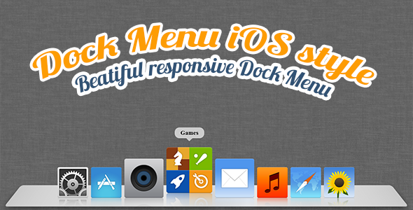
The Dock Menu HTML5/CSS3 solution recreates the iconic Mac OS X dock experience for web applications, offering a sleek, animated navigation system that enhances user interaction. This responsive menu component combines visual appeal with practical functionality, allowing developers to implement a professional dock-style interface that works across devices.
Key Features of the HTML5/CSS3 Dock Menu
This advanced navigation system stands out with several powerful capabilities:
- Customizable Buttons: Each dock item supports complete customization including URL links, custom images, href attributes, and title text
- Flexible Positioning: Place the dock anywhere on screen – bottom (traditional Mac style), top, left, or right based on your layout needs
- Responsive Scaling: Automatically adjusts to different screen sizes while maintaining visual integrity and functionality
- Smart Auto-Hide: Optional feature hides the dock after 5 seconds of inactivity for a cleaner interface (configurable timing)
- Visual Effects: Smooth animations including magnification on hover and subtle transitions between states
Implementation and Customization
Integrating the dock menu into your project requires basic HTML5/CSS3 knowledge with optional jQuery enhancements for advanced behaviors.
Basic Setup
The menu structure follows semantic HTML principles:
<div class="dock-container">
  <ul class="dock-menu">
    <li><a href="#home"><img src="home-icon.png" alt="Home"></a></li>
    <li><a href="#about"><img src="about-icon.png" alt="About"></a></li>
  </ul>
</div>
CSS Customization Options
- Size Control: Adjust both the overall dock width and individual icon dimensions
- Spacing: Fine-tune margin and padding between icons for perfect alignment
- Visual Style: Customize colors, shadows, and reflection effects to match your brand
- Animation Timing: Modify transition durations for faster or slower effects
Advanced Features and Use Cases
Responsive Behavior
The dock intelligently adapts to different viewport sizes:
- On mobile devices, icons may stack vertically when space is limited
- Touchscreen optimizations ensure smooth operation on tablets and phones
- Optional media query breakpoints for specific device adjustments
Performance Considerations
Despite its visual sophistication, the dock maintains excellent performance:
- Hardware-accelerated CSS animations for smooth rendering
- Optimized JavaScript that only runs when needed
- Lightweight footprint (under 50KB including all assets)
Recent Updates and Improvements
The latest version includes several important enhancements:
- Fixed positioning bugs that occurred in certain browser/OS combinations
- Improved touch event handling for mobile devices
- Added new configuration options for animation styles
- Enhanced documentation with more code examples
Complementary Products
This dock menu pairs perfectly with our other premium templates:
Great Onepage Portfolio Template

A complete one-page solution featuring the dock menu as primary navigation, optimized for creative professionals and agencies.
The Tree – Unique One-Page Template

An innovative HTML/CSS template with multiple navigation options including the dock menu variant.
Connect With the Developers
Stay updated with our latest creations and updates:
For implementation support or customization requests, please contact us through our ThemeForest profile. The dock menu solution includes detailed documentation covering all features and customization options.