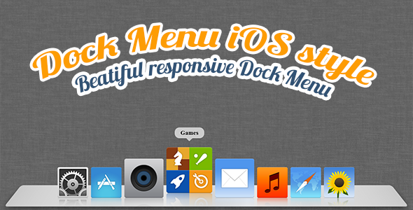
Building a user interface that feels intuitive, polished, and genuinely delightful often comes down to the smallest details. A static navigation bar serves its purpose, but an interactive, animated menu that responds to the user’s cursor creates a moment of surprise and satisfaction. The Dock Menu HTML5/CSS3 brings the iconic, fluid experience of the macOS X dock directly to any website. This lightweight, highly customizable script allows you to place an animated, flexible menu anywhere on your page, transforming a standard navigation element into an engaging visual feature. For designers and developers looking to add a touch of premium, platform-native interactivity without the bloat of a heavy JavaScript library, this solution offers a perfect blend of form and function.
Key Features
- Custom Buttons: Each menu item is fully configurable. You can set a unique URL, image source, hover image, title, and link target for every button, giving you complete control over the menu’s content and destinations.
- Custom Positioning: Place the dock exactly where you want it on the screen. Whether you prefer a bottom-center layout reminiscent of macOS, a side-mounted toolbar, or a floating element in any corner, the position is entirely up to you.
- Custom Size: Easily scale the entire dock and its icons to match your design requirements. Adjust the size to create a subtle accent or a bold, prominent navigation panel.
- Auto-Hide Functionality: Enable an automatic hide feature that makes the menu disappear after 5 seconds of inactivity. This is perfect for full-screen applications, media players, or any design where you want to maximize screen real estate while keeping navigation accessible.
- Custom Margin and Padding: Fine-tune the spacing around and within the menu. This granular control ensures the dock integrates seamlessly with your existing layout and content margins.
- Fully Responsive: The dock fluidly adapts to different screen sizes and devices. Whether viewed on a widescreen monitor, a tablet, or a mobile phone, the animated flexibility and usability are preserved.
- Animated Flexibility: The core visual appeal—icons that scale up and lift when hovered over—is smooth and hardware-accelerated using pure CSS3 transitions. This delivers a 60fps feel without taxing system resources.
Who Is This For? Use Cases
Web Designers & Front-End Developers
If you are building a portfolio, a personal brand site, or a SaaS landing page, this menu adds a layer of interactivity that tells visitors you care about the user experience. It’s an excellent tool for showcasing a curated selection of services, recent projects, or social media links in a visually engaging way. Instead of a standard list of links, you offer a playful, animated experience that invites the user to explore.
Creative Professionals & Digital Artists
Artists, photographers, and videographers often use their website as a digital gallery. A floating, auto-hiding dock menu keeps the focus on the visual content while providing clean access to contact information, project categories, or an “About” page. The custom position and auto-hide feature ensure the menu doesn’t distract from the work itself.
Presentation & Kiosk-Style Interfaces
Because the menu is lightweight and relies on CSS3, it’s ideal for interactive presentations, digital kiosks, or single-page applications where you need a simple, elegant launchpad for different content modules. The ability to position it precisely and enable auto-hide makes it a practical UI component for touch-friendly and mouse-driven environments alike.
Technical Details & Compatibility
This product is built with standards-compliant HTML5 and CSS3, ensuring broad compatibility across all modern web browsers, including Chrome, Firefox, Safari, Edge, and Opera. The animation logic is handled entirely through CSS3 transitions and transforms, meaning there is no dependency on JavaScript libraries like jQuery. This results in a smaller footprint, faster load times, and smoother performance on mobile devices. The script includes a lightweight JavaScript file for handling the auto-hide timer and position logic, but the core visual magic is purely CSS-based. The code is clearly commented and organized, making it easy for developers of any skill level to drop into an existing project or customize further.
Pros and Cons
Pros
- Exceptional Performance: The pure CSS3 approach delivers smooth, battery-efficient animations even on lower-end devices.
- Extreme Customization: Every visual and functional aspect—from icon size to position and auto-hide timing—is exposed for modification.
- True Responsiveness: The menu reflows gracefully across all screen sizes without breaking the layout or losing functionality.
- Zero Framework Dependencies: No jQuery or other heavy libraries are required, making integration into any tech stack (WordPress, React, static HTML) seamless.
- Lightweight Footprint: The entire asset consists of a few kilobytes of code, ensuring it does not negatively impact page load times.
- Proven Author: Developed by MonnyDesign, a reputable author on ThemeForest with a strong track record of support and updates.
Cons
- Desktop-Centric Feel: While responsive, the core “dock” metaphor is most impactful on desktop or tablet screens. On small mobile screens, the functionality is preserved but the visual “lift” effect may be less pronounced.
- Limited Navigation Scope: This is designed as a launcher for a few primary actions, not a comprehensive site structure menu. It works best for 3-7 items, not a full sitemap with submenus.
- No Built-in Dropdowns: If you need multi-level navigation, this dock is not the right tool. It excels as a simple, one-tier launchpad.
Frequently Asked Questions
Is the Dock Menu compatible with content management systems like WordPress or Joomla?
Yes, because it is built with pure HTML5 and CSS3 and includes just a small, self-contained JavaScript file. You can easily integrate it into any CMS by pasting the HTML structure into your template or using a custom HTML widget. There is no dependency on a specific PHP framework, so it works universally.
Does this product include support and future updates?
Yes, as with all items distributed through ThemeForest, this product comes with a standard support period from the author, MonnyDesign. They are known for providing timely assistance for any setup or customization questions. The item also includes a documented changelog, indicating that the author actively addresses bugs and maintains compatibility with current browser standards.
Can I use the Dock Menu in commercial projects?
Absolutely. When you purchase the Dock Menu HTML5/CSS3 item, you are granted a regular license that allows you to use it in a single commercial project. Whether you are building a client website or your own product, you have the full right to implement this menu as part of your work.
Final Verdict
The Dock Menu HTML5/CSS3 delivers exactly what it promises: a clean, animated, and responsive menu that borrows the best interaction design from the macOS ecosystem. It is not a do-everything navigation solution, but it excels as a specialized tool for creating a memorable user interaction point. The combination of custom button properties, flexible positioning, and the clever auto-hide feature makes it a valuable asset for personal portfolios, creative agency sites, and application launchers. Backed by the solid reputation of MonnyDesign on ThemeForest, this is a low-risk, high-impact purchase. If you are ready to replace yet another static link bar with a piece of functional art that users genuinely enjoy interacting with, adding the Dock Menu to your toolkit is a smart decision for your next project.