Professionally designed notification boxes are a staple of polished web interfaces. They guide users through actions, confirm completions, and alert them to critical errors without breaking the visual flow of a site. However, building these elements from scratch—along with their animations and cross-browser styling—can consume significant development time. This is precisely where a dedicated UI kit becomes invaluable. Notification Boxes v1.1.1 is a lightweight, CSS-driven solution designed to streamline this process. It offers a suite of eight distinct color schemes and seven unique animation effects, all powered by the familiar jQuery library. Instead of wrestling with image sprites or complex markup, developers and designers can implement clean, professional-grade feedback mechanisms in minutes. This item is engineered to enhance user experience (UX) by providing immediate, visually coherent responses to user interactions, ensuring your web project feels responsive and considered.
Key Features
This asset distinguishes itself through a combination of simplicity and aesthetic flexibility. The feature set is curated to cover the most common notification scenarios without introducing unnecessary bloat. Here is a breakdown of the core attributes that make this collection a practical choice for any project:
- 8 Beautiful Colors: The kit includes a versatile palette: green, yellow, orange, red, pink, dark blue, light blue, and white. This range allows you to assign specific colors to different message types (e.g., green for success, red for errors) while maintaining brand consistency. Whether you are building a corporate dashboard or a personal blog, the color options ensure the notifications complement your existing design language.
- 7 Awesome Effects: Beyond static displays, the animation engine provides dynamic engagement. You can choose from blink, fade in, slim, fixed, link, title, and bold effects. This variety lets you control the level of attention a message demands, from subtle fade-ins for minor updates to persistent blinking highlights for critical system alerts.
- Animated Using jQuery: The logic is built on the robust jQuery framework. This ensures smooth, reliable animations across modern browsers and simplifies integration for developers who are already leveraging jQuery in their stack. It avoids the need for complex vanilla JavaScript or heavy animation libraries.
- No Images Are Used, Everything is CSS: This is a major performance and scalability advantage. Because the buttons and boxes are rendered entirely with Cascading Style Sheets (CSS), there are no image files to load, which reduces HTTP requests and improves page load speed. Furthermore, CSS rendering ensures crisp, sharp visuals on high-DPI (Retina) displays, a critical factor for modern design standards.
- A PSD Is Included: For those who need to customize the look beyond the CSS parameters, a Photoshop Document (PSD) file is provided. This allows designers to alter the gradient patterns, shadow angles, or border styles to create bespoke variations that can then be converted back into CSS.
Who Is This For? Use Cases
The versatility of this kit makes it applicable across a broad spectrum of web development scenarios. It is not limited to a single platform or niche; rather, it solves a universal UI requirement. Below are common situations where these notification boxes elevate the user experience.
Web Developers and Freelancers
For developers building themes for clients, having a reliable component library is a huge time-saver. Instead of coding a set of notification functions from scratch, you can install this kit and instantly add robust messaging systems to contact forms, login screens, or admin panels. The extensive documentation allows you to hand off the project to a client with confidence, knowing they can understand how to tweak styles or add new messages using simple HTML classes. The lightweight nature of the files means it won’t bloat the final product.
WordPress Theme Designers
This kit is a natural fit for WordPress theme development. By incorporating the CSS and JS files into the theme’s header, you can now use the notification classes in custom page templates, widgets, or plugin hooks. For example, add a “fixed” class notification for a cookie consent banner or a “fade in” effect for a “Welcome to our blog” message. It is an excellent method to add immediate polish without relying on a bloated page-builder plugin.
E-commerce and SaaS Platforms
User trust is the currency of online commerce. Whether you are on WooCommerce, Shopify, or a custom SaaS platform, transactional feedback is essential. Use the green notification to confirm a successful payment or a red notification to highlight a declined credit card attempt. The clear, visually distinct boxes reduce user error and frustration, directly contributing to higher conversion rates by guiding the user through the checkout flow effortlessly.
UI/UX Prototyping and Wireframing
Rapid prototyping is critical for testing userflows. This kit allows product managers and UX designers to simulate real-world data states—loading, saving, error, success—without engaging a developer for custom work. You can set up a functional prototype in a single afternoon, allowing stakeholders to feel the interaction dynamics of the final product.
Technical Details & Compatibility
Understanding the technical constraints is crucial before committing to a new library. This kit is built with a focus on compatibility and ease of setup, but it has specific requirements you should be aware of to ensure smooth implementation.
Core Requirements: The kit requires jQuery to be loaded on the page. The `notification.js` file handles the animation logic, while `notification.css` defines the visual styling. Both files are lightweight and minifiable. The implementation process involves linking these two files in the `HEAD` section of your HTML document.
Browser Support: The styling relies on CSS3 features such as gradients and box shadows. The documentation explicitly notes that while Opera sees a flat color background (due to missing gradient support), the gradient background works in Internet Explorer via proprietary filters. The kit is also explicitly stated to be compatible with Chrome 7 & 8, and includes support for legacy browsers like IE6+ for the functional aspects. It is safe to assume it works perfectly on all modern versions of Chrome, Firefox, Safari, and Edge released after 2011.
Implementation Structure: The entire system is built on simple `
Pros and Cons
To provide a balanced evaluation, here are the distinct advantages and considerations one must keep in mind when choosing this asset for their toolkit.
Pros
- Exceptional Performance: Because everything is CSS-based and no images are used, the asset loads instantly and imposes negligible overhead on the website’s overall speed.
- Incredible Ease of Use: The syntax is incredibly straightforward. Adding a notification is as simple as writing a class name. Even junior developers can implement this within minutes.
- Robust Styling Options: The inclusion of a PSD file is a rarity for such small components. It offers a professional pathway for deep customization, ensuring the boxes can be adapted to match the exact brand aesthetics of any client.
- Clean Aesthetics: The CSS gradients and rounded corners (implied by the CSS3 nature) offer a polished, Web 2.0 style look that remains professional to this day. The “no images” approach guarantees that they never look blurry or pixelated.
Cons
- Dependency on jQuery: In modern development, many developers are moving toward native JavaScript (Vanilla JS) to reduce dependencies. If a project does not currently use jQuery, loading it solely for this widget may feel heavy or unnecessary.
- Limited Functionality Scope: This kit is purely for visual feedback. It does not include “toast” notification systems with auto-dismissal timers or queue management for multiple simultaneous messages. It is a classic display component rather than a full-featured notification manager.
- Aging Browser Constraints: While the code works, the need to mention IE6 and Opera specific filters indicates its origin in the early 2010s. While functional, modern developers might expect more advanced features like micro-interactions or CSS transitions instead of jQuery animations.
Frequently Asked Questions
Is Notification Boxes compatible with WordPress themes and WooCommerce?
Yes, absolutely. Because this is a simple CSS and jQuery asset, you can integrate it directly into any WordPress theme by enqueuing the files in the `functions.php` file. Once loaded, you can use the notification classes (e.g., `notification_red`) in any PHP template, within the WooCommerce product pages, or inside custom HTML widgets in the sidebar. It works regardless of the underlying PHP framework.
Can I customize the gradient colors or corner radius without the PSD file?
Definitely. While the PSD is provided for mockups, the live styling is controlled by the `notification.css` file. You can edit this file to change the `background-color` properties, adjust the `border-radius` for more rounded or sharper corners, and tweak the `box-shadow` X/Y offsets to enhance the depth. The code is un-obfuscated and well-structured, making manual overrides very simple. You can also override the classes with custom CSS added after the main file.
Does the “fixed” effect make the notification stay on the screen when scrolling?
Yes, the “fixed” effect serves a specific purpose. While a standard notification box scrolls away with the page content, applying the “fixed” class ensures the notification box remains anchored to a specific position in the viewport (usually the top) regardless of the user’s scroll behavior. This is highly effective for critical cookie consent bars, “maintenance mode” warnings, or breaking news alerts that require persistent visibility until the user actively dismisses them.
Final Verdict
In the landscape of digital asset creation, reliability and efficiency are paramount. Notification Boxes v1.1.1 delivers on both fronts by offering a clean, dependency-light solution that solves a universal problem: how to communicate effectively with the user. It removes the need for excessive CSS writing and debugging, allowing you to focus on the core functionality of your application. While it lacks the “auto-hide” features of newer JavaScript libraries, its simplicity is its superpower—it does exactly what it promises without unexpected behavior. Since its release in 2011, it has proven its longevity, with a changelog showing a commitment to bug fixes like IE6 support and gradient filters, which adds to its trustworthiness. For designers and developers looking to enhance their existing projects with a professional aesthetic or for those building a new theme from scratch, this asset is a valuable addition to your collection. Upgrade your user interface today and ensure your website communicates with clarity and style—purchase Notification Boxes on ThemeForest to get instant access to the source files and documentation.
Related Posts
jQuery Slider Evolution Nulled
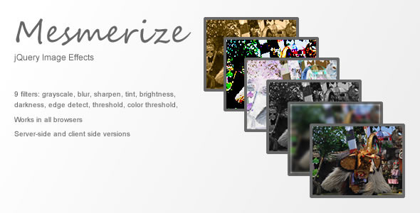
Mesmerize: jQuery Image FX Plugin Nulled