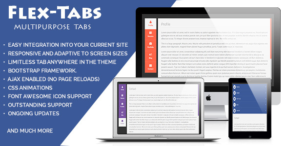
FlexTabs is a responsive navigation solution that seamlessly transforms between tabbed layouts and accordion-style displays depending on screen size. Built with CSS3 and jQuery, this versatile component offers developers a clean, customizable way to organize content across websites, blogs, and ecommerce platforms.
Why Choose FlexTabs for Your Website Navigation?
Modern websites demand flexible navigation systems that adapt to various devices while maintaining usability. FlexTabs addresses this need with several key advantages:
- Responsive Behavior: Automatically switches between horizontal tabs (desktop) and vertical accordions (mobile) without requiring separate implementations
- Content Versatility: Supports diverse content types including videos, data tables, forms, pricing charts, and text-heavy sections
- Design Flexibility: Customizable color schemes and layouts to match any website aesthetic or branding requirements
Core Features That Set FlexTabs Apart
Advanced Layout Options
FlexTabs provides multiple display configurations to suit different content structures:
- Horizontal tab layouts for traditional desktop navigation
- Vertical tab arrangements for sidebar content organization
- Accordion mode activation based on responsive breakpoints
- Customizable transition animations between states
Technical Specifications
The solution incorporates modern web technologies for optimal performance:
- Built with pure CSS3 animations for smooth transitions
- Lightweight jQuery implementation (compatible with latest versions)
- Bootstrap v3 integration for consistent styling
- Font Awesome icon support for visual enhancements
- Valid XHTML markup for standards compliance
Practical Implementation Scenarios
Ecommerce Product Displays
Online stores can leverage FlexTabs to organize product information:
- Tabbed specifications and technical details
- Accordion-style FAQ sections for mobile users
- Video demonstration panels that resize appropriately
Corporate Website Content
Business sites benefit from the solution’s organizational capabilities:
- Service overviews with tabbed categorization
- Mobile-friendly team member profiles
- Responsive pricing tables that adapt to screen size
Customization and Extensibility
FlexTabs offers numerous customization options through:
- Commented CSS files for straightforward style modifications
- Modular JavaScript structure for functional extensions
- Pre-built theme options that can serve as customization templates
- Cross-browser compatibility testing across major platforms
Integration With Popular Frameworks
The solution works seamlessly with common web development tools:
- Bootstrap 3+ compatibility for responsive grid alignment
- jQuery plugin architecture for easy implementation
- Font Awesome integration for scalable vector icons
- Google Fonts support for typography customization
Technical Requirements and Dependencies
For optimal performance, FlexTabs utilizes:
- jQuery 1.9+ for core functionality
- Modernizr for feature detection (optional)
- CSS3-compatible browsers for animations
- HTML5 doctype for proper rendering
Support and Documentation
Users receive comprehensive resources for implementation:
- Detailed setup instructions with code samples
- Troubleshooting guides for common issues
- Direct developer support via email contact
- Regular updates for compatibility and features
For organizations seeking a robust, adaptable navigation solution, FlexTabs delivers responsive functionality with extensive customization potential. Its ability to maintain usability across devices while supporting diverse content types makes it a valuable addition to any modern web project.